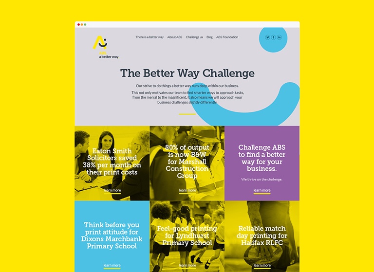
The Challenge
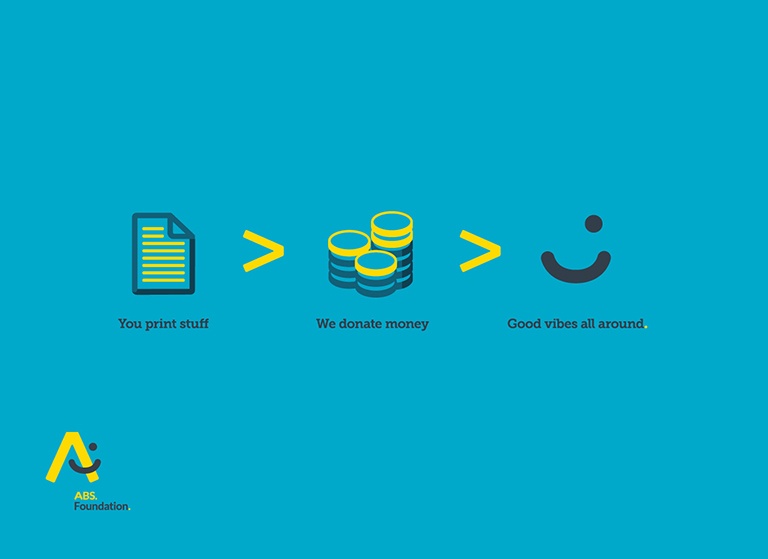
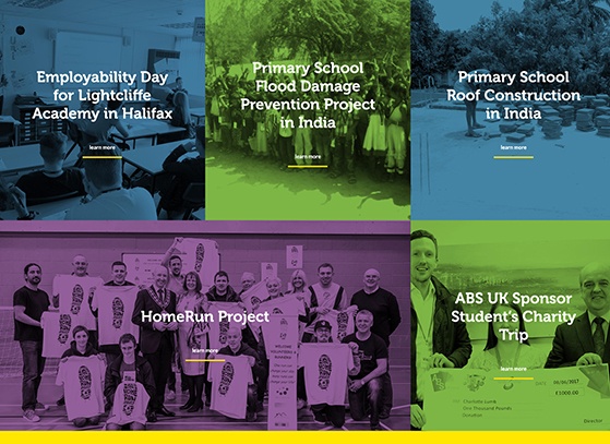
ABS was a company with a great story to tell. They were a genuinely positive force for good - channelling a big chunk of their profits into their ABS Foundation, which supported great causes all over the world. The trouble was, they supplied printers and photocopiers, which isn’t most people’s idea of exciting!
The Approach
87% of consumers say it’s important for brands to act with integrity at all times. So ABS already had some great credentials to share. But when we immersed ourselves in their brand, we discovered that this positive attitude permeated their whole business. They were always listening to their customers and going beyond the call of duty to make them happy.
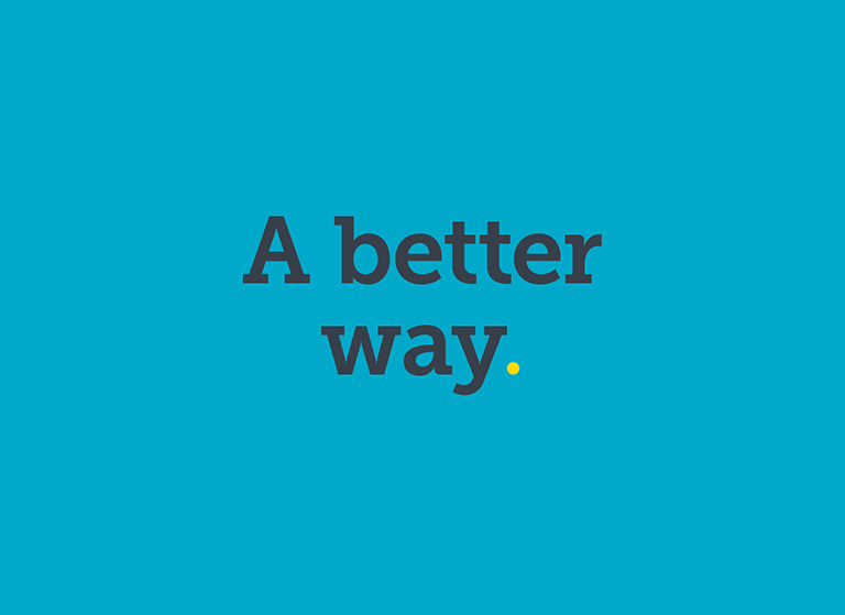
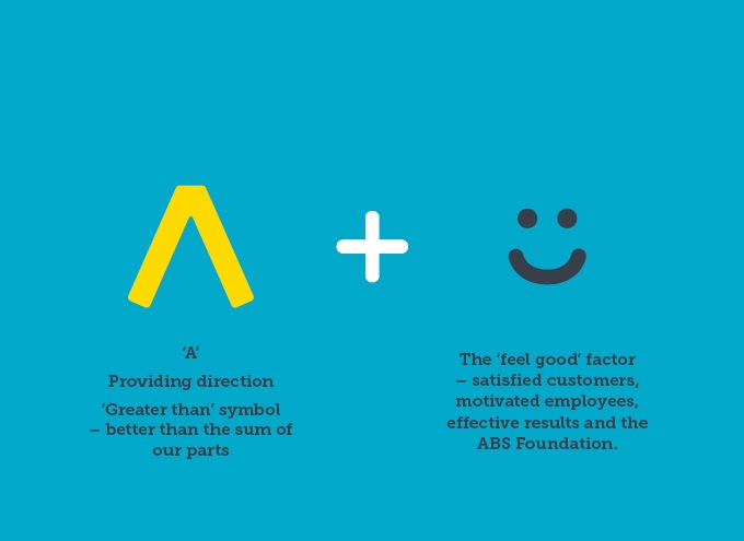
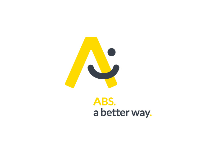
And that led us to one simple, powerful brand message: ABS. A Better Way.
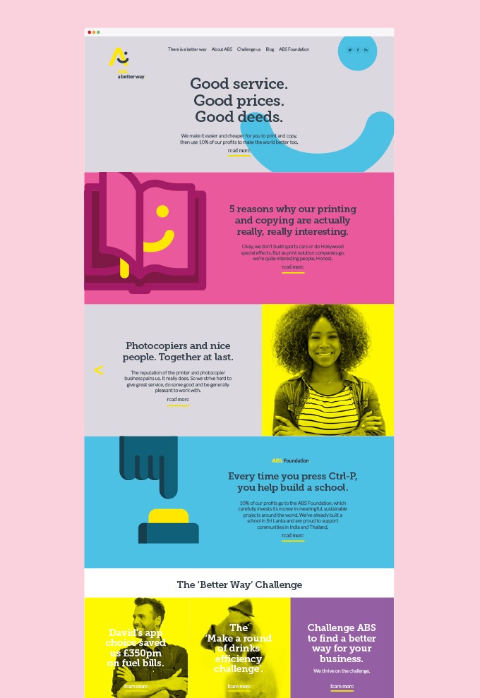
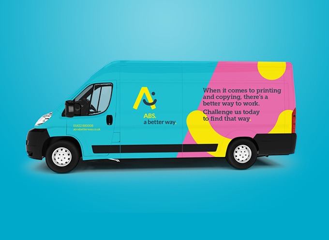
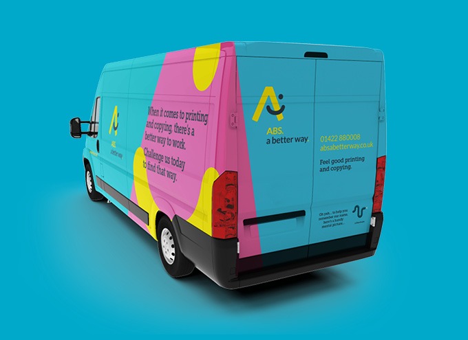
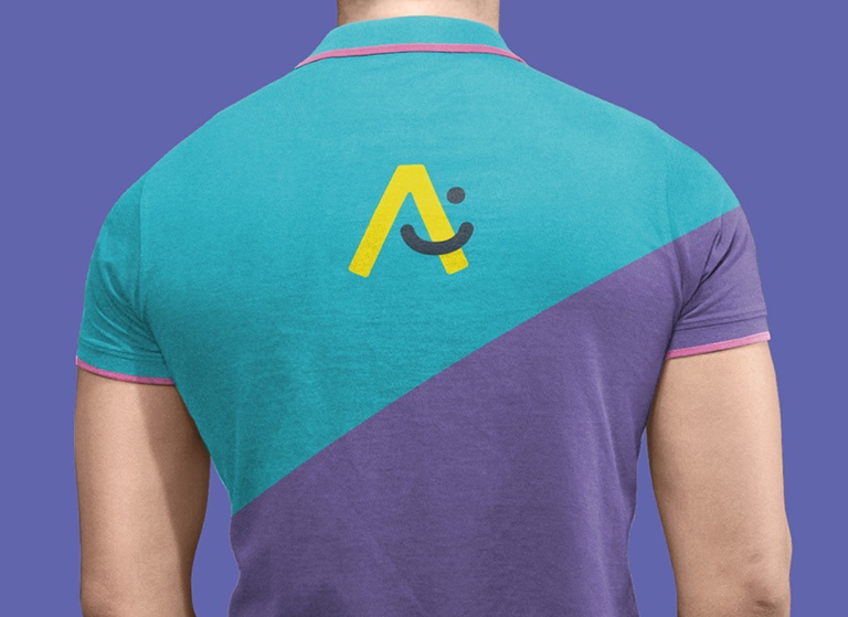
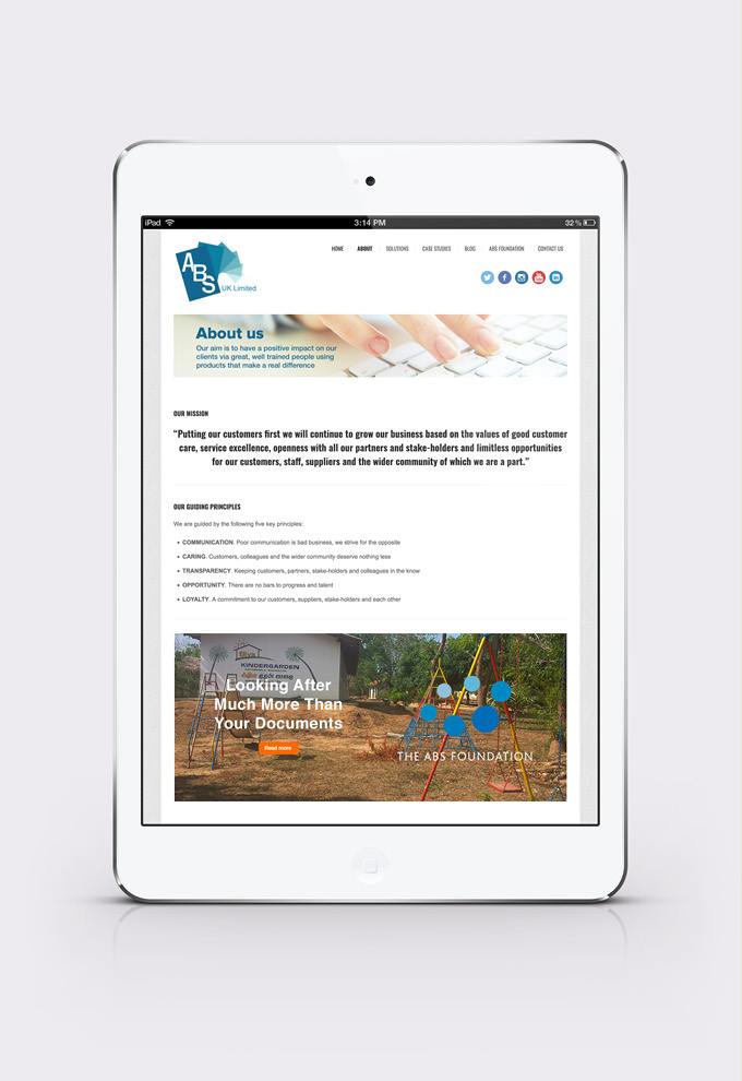
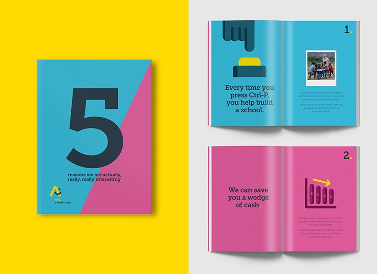
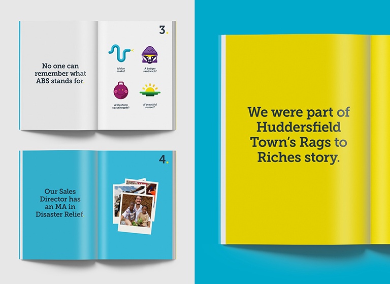
To capture the spirit of their helpful team, we defined a distinctive visual language and a playful tone of voice. It took a clean, simple, non-technical approach and used straightforward, light-hearted language to help ABS stand apart from the complex jargon so often found in the sector.
The Result
The rebrand made the whole team feel excited and proud to be part of ABS. But it also had a measurable effect on their business. Enquiries increased hugely, leading to 123 new accounts in the 9 months after the rebrand. Maintenance contracts also went up by 50%. Another nice side effect was that ABS found themselves working with more and more strongly ethical companies who shared their ethics and values.
"10 went above and beyond our expectations and we couldn’t be happier with the results." David Lees, Marketing and CSR Director, ABS