The Challenge
Eden is a destination brand perfectly positioned in the heart of High Wycombe, offering a broad mix of retail, food & drink, residential, leisure, events, and experiences.
With a relative blank canvas, it was important we understood the challenges, uncovered the unique characteristics of the brand proposition with a vision to attract the right brand partners and entice a broad audience to explore the jewel that is Eden.
It's clear Eden needed a brand that reflected their exciting ambitious future, an Eden experience less ordinary, like no other.
The Approach
We were all agreed that the potential to create something truly special was as massive as Eden itself!
Something that the destination could love, own and nurture for years to come, loved by everybody who lives, works, and visits there.
We started, with Brandschool, our immersive full day workshop of brand exploration. Visiting the location and meeting with key Eden Stakeholders helped us to understand Eden in more depth, the pride and belief in the area was palpable and this enabled us to establish a strong positioning and strategic approach that would underpin our creative thinking.
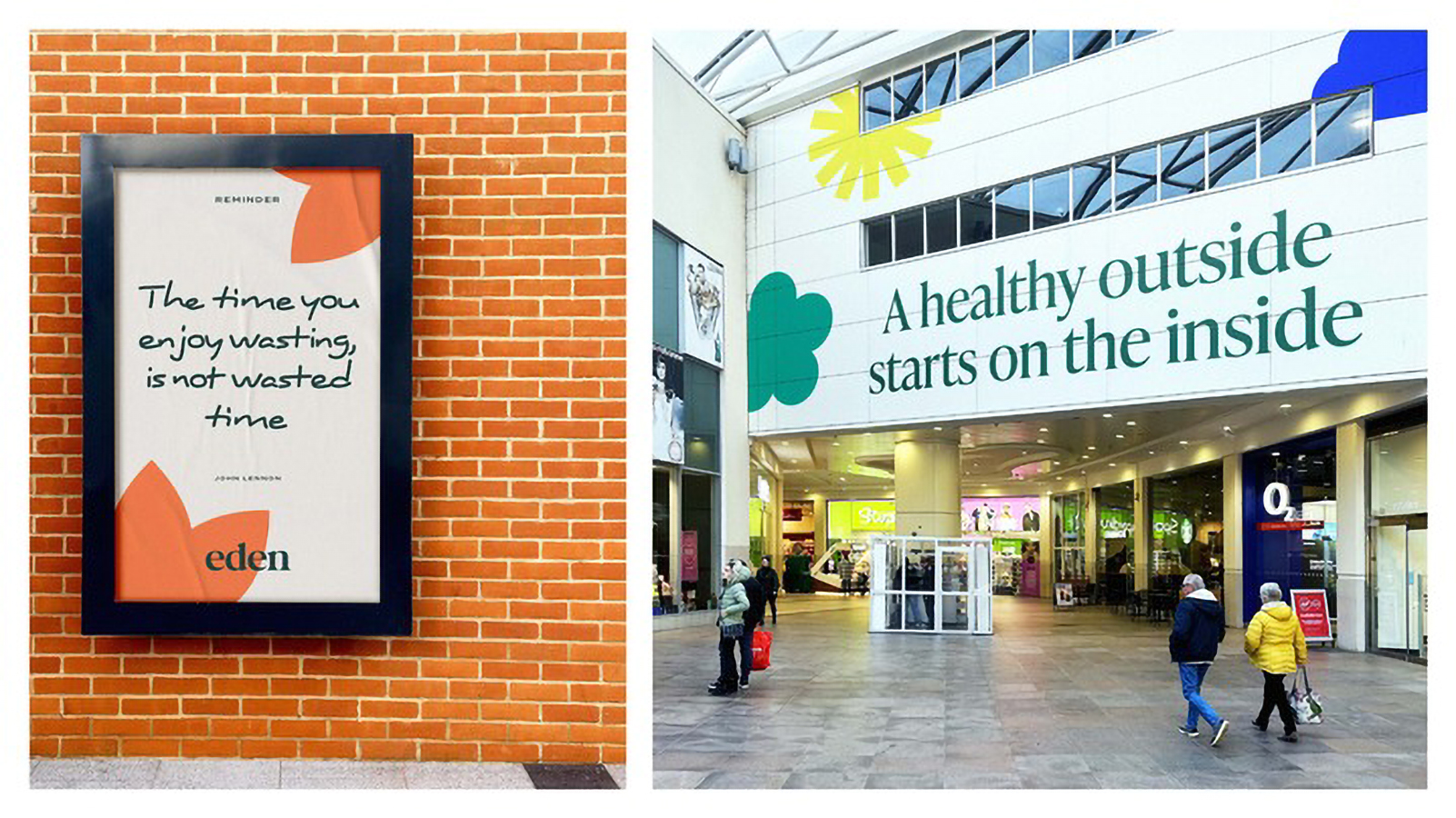
With a clear vision to enrich the lives of the community of High Wycombe (and beyond). Enjoyment is increasingly becoming the key differentiator in attracting and retaining customers. Enjoyment and experiences have become more important in a consumer’s purchase journey. Through multi-sensory experiences Eden is a hub for feeling good, for friends, for family, for all, for all year round. For everything you want. Eden offers everything you need. So, we built on this to create a simple Big Idea: Enjoy Every Moment.
The Result
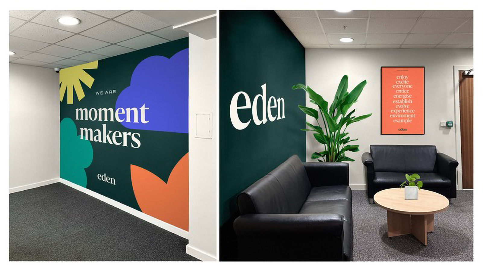
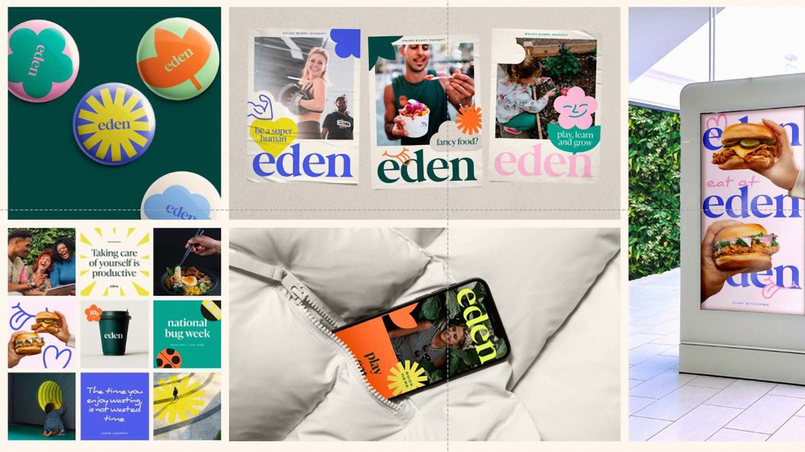
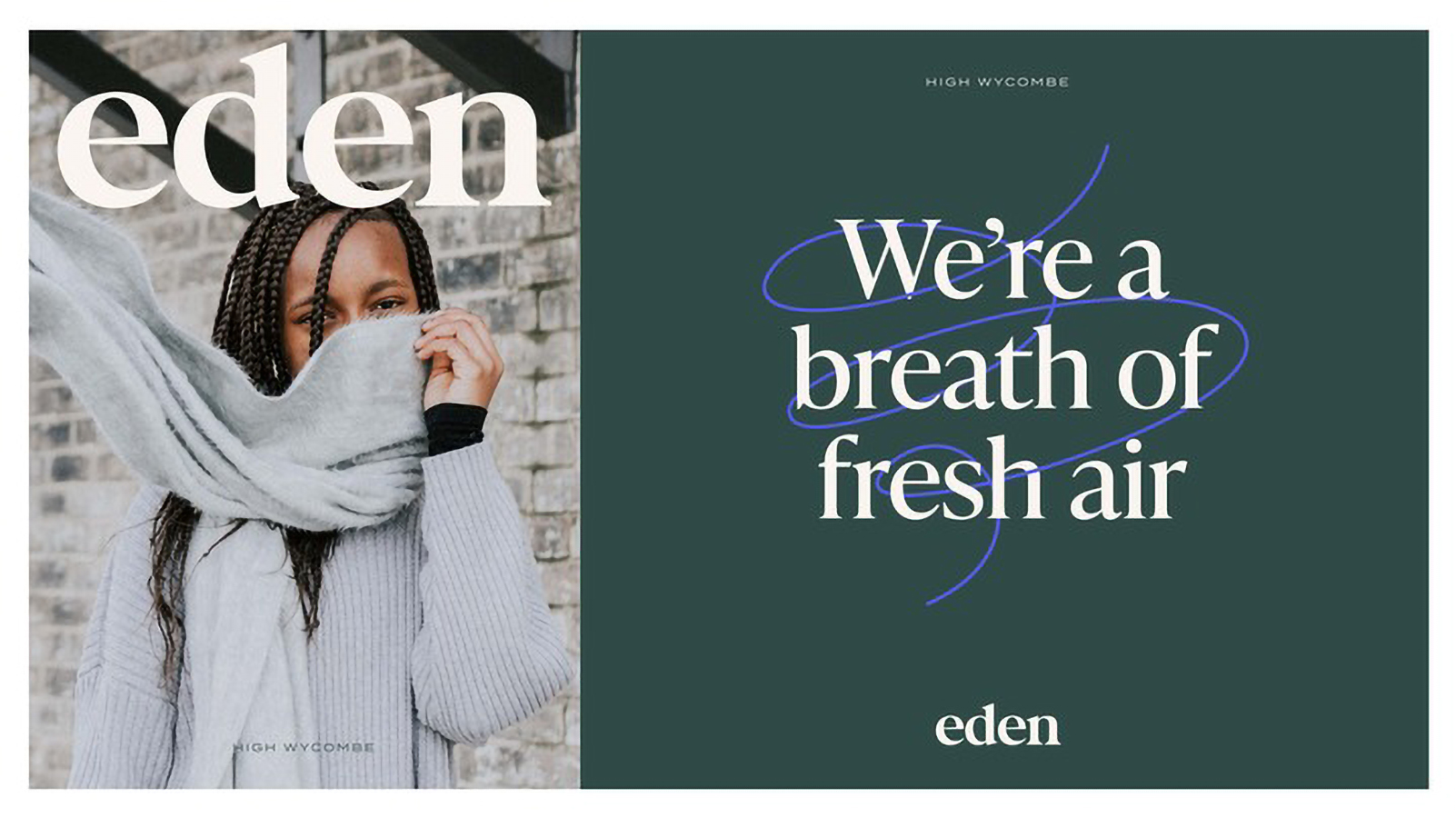
A refreshed, expressive, vibrant brand with an authentic voice and kind heart.
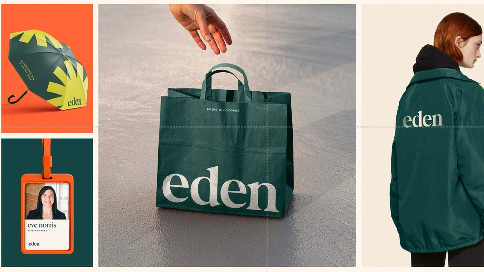
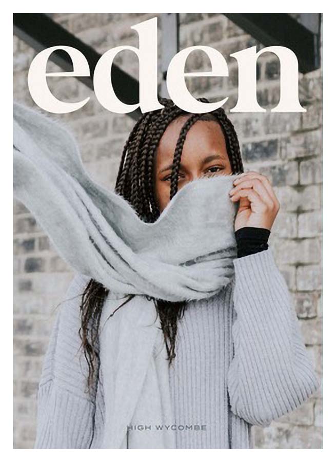
Visually beautifully, yet strong, bold, and playful our brand identity is adaptable and flexible allowing a wide range of usage and applications through Colour & Materials, Typography, Iconography, Illustration and Imagery.
The refined brand mark carefully crafted to modernise its appearance, encapsules a warm and adventurous energy.
The Primary colour palette adds a depth of expression with two core brand colours Ground and Light, the Secondary palette is inspired by the seasons that can be enjoyed all year round at Eden. To enhance the brand colours, we celebrate the importance of materials and textures. Combined they should be used to add a tactile component to our brand creating a multi-dimensional presence.
"Working with 10 has given Eden much needed direction, one which will allow us to continue building strong campaigns, execute our marketing strategy and achieve our ambitious objectives. Our new brand truly reflects our exciting future, we have a brand story, an identity, a personality, and clear tone of voice, it’s like nothing we’d had before. We can’t thank 10 enough for all their excellent work." – Rebecca Gomme, Marketing Manager, Eden